Good Morning (1959)
Yasajuro Ozu
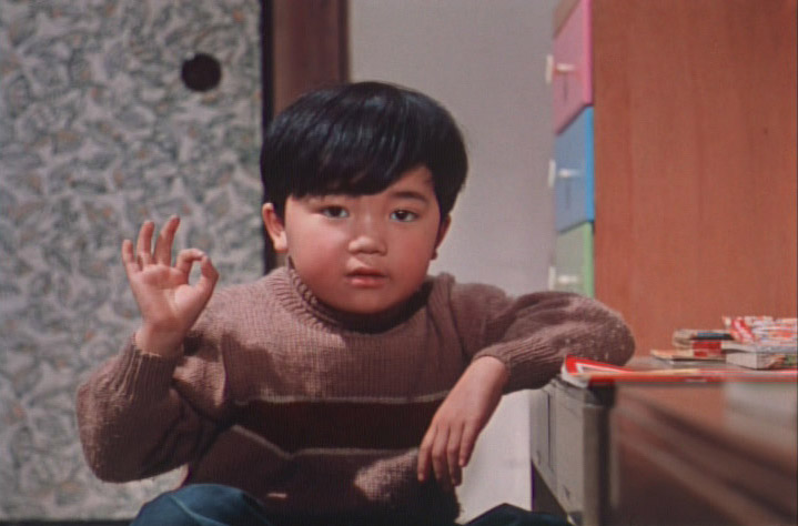
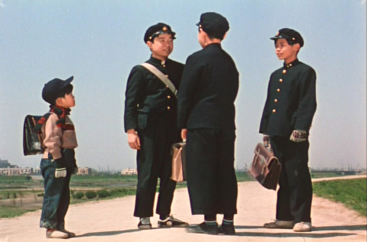
The first thing anyone but a dog would notice about Yasujuro Ozu’s Good Morning is that there is one consistent color scheme—dodger blue and red—throughout the entire film. Obviously this represents a lot of careful effort, but is the film better for it? The answer is yes because it reinforces one of the film’s major themes, which is the basic idea of social interconnectedness. The people in Good Morning all live in a small neighborhood of row houses, which are so similar that one of them even enters the wrong house thinking it’s his. Of course, Ozu celebrates their individuality as well as their sameness. But either way, the pervasive color scheme becomes a conscious or unconscious symbol for this theme. And the color is just a part of it. There is also a consistent musical score, a characteristic brand of levity—including more jokes about breaking wind than you thought possible—as well as a series of familiar and repeated social gestures all of which unify and strengthen. Each time we recognize these elements, we gain a greater sense of their meaning as a whole. Thus, it is not so much that the whole is greater than the sum of the parts, but rather the sum of the parts is greater because of the whole.
Even a fart becomes a symbol of commonality shared across generations from schoolboys effectively playing a Japanese version of 'pull my finger' to Mr. ____ amusing himself by breaking wind.If the film were instead about the randomness of life, then perhaps every scene should have been different colors and shot using a vast array of techniques. That this represents a far easier task is certainly hinted at by the large number of films which are a complete jumble and relatively rare Ozu-sitings.Minoru: “Farting is okay.”
Jonathan Rosenbaum:Perpee:"In a context where banal greetings among neighbors, schoolboy farting contests, and sweet nothings between a couple are treated as structural equivalents, and sliding doors and shot changes become integral facets of the same ‘architecture’—an interrelating complex of adjacent, autonomous units—the fascination is how even throwaway details become part of the design.
A poster for the defiant ones, for instance, alludes not only to the recalcitrant sons, but the sense of antagonistic parties chained together by circumstances that often seem to function just below the surface of the everyday pleasantries. A grandmother muttering gripes in between her prayers, a drunken Tomizawa coming home to the wrong house, the young scat-singing couple (at whose home the boys watch television, courting disapproval) being quietly being quietly hounded out of the community, a thoughtful Keitaro wondering if television will ‘produce 100 million idiots’ or pondering his future retirement: all these moments are characteristically uninflected, and each goes straight to the heart of the film.""Good Morning was Ozu's third colour film. He was keen to experiment with colour yet he eschewed any frame wider than standard Academy ratio, saying that the wide frame looked "like a piece of toilet paper". So all Ozu films are in 4:3. Ozu particularly liked to make the colours very bold and he loved the reds he got from the Agfa film he regularly used. He often graphically matches colours and objects between cuts, leading us through space this way, so for example a red shirt hanging on a washing line will be in the same part of the frame as a red teapot cosy in the next shot. This subtle attention to detail, the unflinching camera (no movement, no pans), and the fine performances combine to create a gloriously lyrical representation of suburban life in late 1950s Japan as it became rife with Western influences such as jazz (the young couple sing scat and play pretend double bass as they walk through the streets); US films (the same couple have a poster for "The Defiant Ones" on their wall); and TV (the root of the problem)."
Charles W. Moore takes it from here in his essay on the use of plaster in architecture.So the red and blue is that coat of white paint applied throughout the film. Both that and the lack of camera movement work together to focus our attentions on the subtle intracies of the characters and the story itself.“To clarify plastic forms, the designer must shift his attention from planes and their edges to volumes, so that the attention of the observer will be drawn to the relationships of solid forms in space. Greek island villages such as Mykonos are, for their size, extremely complex aggregations of tiny dwelling units and even tinier churches, with tortuous paths of circulation winding among them. If these complexes were built of a variety of materials, or even of a few materials which called attention to themselves, the visual result would be sheer chaos. As it is, however, a coat of plaster painted white is applied to almost all the surfaces and the result is an exciting kind of visual order. In Alberolbello, in southern Italy, the coating is simply a lime wash, applied frequently. The result at both places is that the emphasis is all on the forms themselves…”
“Good Morning is delightful the first time you see it; it works like a charm. But it doesn’t deepen on subsequent viewing, partly because its ‘fart’ jokes become tiresome and partly because its very construction so neatly alternates themes, that craft triumphs over complexity. Even the everrespectful Donald Richie admits in his book that this is Ozu’s most ‘schematic’ film. It reworks materials from his earlier, silent masterpiece I was Born, But (the two little boys went on a hunger strike in that one), but without the kicker of the boys becoming ashamed of their father for kowtowing to his boss. Here, there is nothing to challenge the father’s authority but a mundane, easily satisfied acquisitiveness on his sons’ part.”“Even though his sketches can be very colorful, the color does not overtake the sense of order. This sounds philosophically complicated, but it is very basic. It is at the very center of the art of architecture. It is this sense of order that I want to pursue in my work.”
— Tadao Ando
— Philip Lopate
Philip, so demanding? When did you get like that? You lament ‘that craft triumphs over complexity.’ Now if we’re talking about Australian Shiraz or most California Cabs, then I’m with you all the way. But why can’t we let I was Born, But and Good Morning serve as a two halves of one great loaf. Would it be out of line for me to speculate that The Trouble With Harry isn’t your top Hitchcock? Fart jokes? Tiresome? Preposterous!
Another (good) film with a unifying color scheme is Lost Honor of Katharina Blum. I won't tell you what the color is. You'll have to guess!
Movies Home