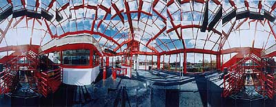
I just had the amazing fortune of randomly chancing upon a series of photographic works by Masumi Hayashi hanging in the Cleveland Art Museum. That will teach me to skip out of work early—whenever possible.
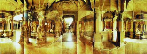
What Hayashi does is take about 50 or so little 5x5 inch photographs (the technical term is ‘boatload’) of a subject covering the entire field of view. She then rearranges the pictures like tiles in a mosaic to recreate her version of the original scene. Sounds perfectly post-modern and simple, doesn’t it? Think again. If you consider that each individual photograph has four sides (trust me) then multiply by two decisions for each side—where to cut the edge, where to place in relation to the adjacent photo—that's eight decisions right there. Then multiply that by say 45 photos (the number in ‘Jain Temple’ for example). That’s 360 decisions! When was the last time you did anything that required 360 of anything? Should I have a donut and then sit on the toilet? Or sit on the toilet and then have a donut? Or should I just put the donut on the toilet and sit on it. Oh, I'm definitely having the donut. In any case, with each and every panel, there is clearly a chance to either increase or decrease the overall meaning and impact of the work. This means she has to be able to assemble all of these images into what must be an immense working visual memory in order to come up with a coherent whole. Just think of her as a giant supercomputer of Japanese descent.
And there is much room for creativity. For example, she can snap one panel at one time of day and mix it with different ones from different times, with different light and, of course, people. By making subtle variations on the visual and temporal reality, she is conducting a kind of impressionism which has as much in common with film editing as conventional photography. Her powers are immense. She can take a Cleveland RTA station and turn it into a semi-abstract thing of beauty. Now don’t get me wrong. Many times have I contemplated the unassuming beauty of some of those choicer RTA stations. But not enough to get off the train or anything completely insane like that. And when she starts with a subject as beautiful as a Jain temple in India, for example, the final result is completely sublime, which brings me back to the wall in the art museum.
And for those of you sitting there thinking, “Oh, yeah, I could take a bunch of little pictures of something too.” No, you couldn’t. Not like this. Her style is built on solid conventional photographic methods (each picture must itself be a very good picture). Let’s look at a specific work, ‘Jain Temple’, and some of the things she does which go beyond the ordinary.
First, there is the overall visual feeling of the cavern which is accentuated by showing multiple vantage points all in the same picture. Whether real passageways or just nooks and crannies, the work is loaded with places into which your eyes and heart want to go. You explore the image like a Chinese scroll or an architectural model. And all of this is made feasible by the final size of the work, which is about four or five feet across. A smaller photograph could not contain multiple vantage points in such harmony. They would be too close together. It would be discumbobulating like an Escher drawing or an episode of MTV’s ‘Real World’. Or the vantage points would have to be very small, and have less detail and less impact. If you don’t believe me, you can ask Roy Lichtenstein or Klaus Oldenberg or Godzilla.
One of these passageways (in the middle there, you see it?) leads to a step down into a separate room. Wow. I had never consciously realized how magnificent a step down is. You remember them from grade school, when you would visit your rich friends’ fancy suburban villas. But somehow a step down into a shag carpet and big screen T.V. just isn’t quite the same. This step down is pure bliss with the hidden light source and lure of distant secrets. Notice how the little two inch raised parts of the temple floor give it the essence of a busy market street with all its life and activity. Juxtaposed with the stillness and solitude of the temple itself, the effect is quite surreal. The whole scene is like the ancient section of the British Royal Museum only it’s the real thing and not suffering the incurable loss of transplantation.
As for the post-production. I’m reluctant to speculate on what theoretical concerns inform the process, but one particular thing stood out. There are certain details carved into the ceiling of the temple. And in certain instances, it appears as though Hayashi has actually multiplied and rearranged them slightly making them more visually complex than they really are. Purists would probably blow a gasket over this. I love it.

Now I’m going to assume this is one of the most happening views in the entire temple. If not, then this is the coolest temple in the world. Which brings us to the issue of eye—where to point the camera. In other words, she not only has to take the pictures, but she has to find the right subject—and go there. This effort cannot be overstated. She got the funding. She sat on the plane for God knows how long. She had an old man try to clean her ear with the most frightening instrument ever while ten small children tugged at her shirt in desperation, none of which is conducive to good photography. Meanwhile I was probably back home, defending the country by ordering a chicken McNugget.